9.1.
9.2.

9.3.
9.4.
9.5.

9.6.

The is a compositional rule which states that an image should be imagined as divided into nine equal parts by two equally-spaced horizontal lines and two equally-spaced vertical lines, and that important compositional elements should be placed along these lines or their intersections. Proponents of the technique claim that aligning a subject with these points creates more tension, energy, and interest in the composition than simply centering the subject would.
The derives from the famous mathematical Fibonacci sequence. Two quantities are in the golden ratio when their ratio is the same as the ratio of their sum to the larger of the two quantities. This proportion, vastly found in nature, is considered aesthetically pleasing and was extensively used by Leonardo Da Vinci and by some of the greatest artists of the world, from Michelangelo to Raphael and Botticelli.
It is a tool able to draw attention to the important elements of the composition, to highlight the main information, and to create an aesthetically pleasing layout.
Some other suggestions that follow other principles of design are:
• don’t be afraid to create your design with plenty of blank space: it’s rest for the eyes;
• don’t be afraid to be asymmetrical: it often makes the effect stronger. It’s okay to do the unexpected;
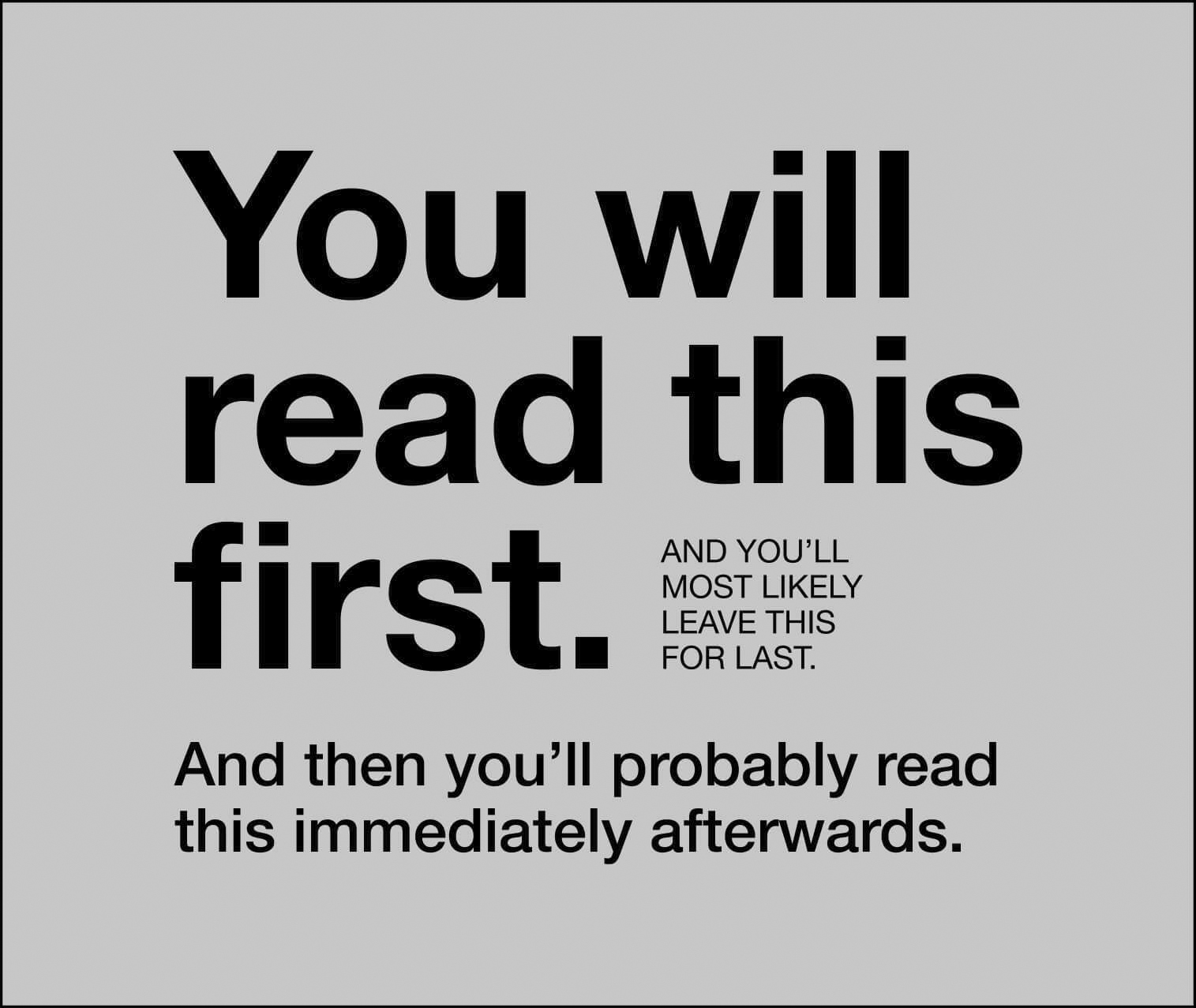
• don’t be afraid to make words very large or very small: both can be effective in the right situation;
• don’t be afraid to make your graphics very bold or very minimal, as long as the result complements or reinforces your design.
Adapted from: aperta